Nice! So you are using agile metrics within your team or organization.
I’ve worked for a company once that believed in data transparency and provided a UI where anyone could plot charts with any squad metrics.
Transparency is great. It reinforces trust and promotes collaboration. However, you must use it wisely. Otherwise, it may raise misunderstandings. People tend to bring their context and past experiences to the table, which is often useless since their advice doesn’t relate to reality.
An exaggerated example
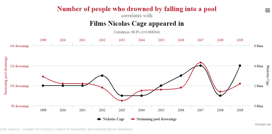
Yes, this is a chart correlating the number of people who drowned by falling to a pool with the number of films on which Nicolas Cage appeared yearly.
I firmly believe you would not recommend Nicolas Cage to stop acting in an attempt to reduce the drowning rate because it makes no sense. The lines seem to go together, but there are not enough pieces of evidence that one implies in the other. At least, not solely looking to the chart.
An example of an agile team working with metrics
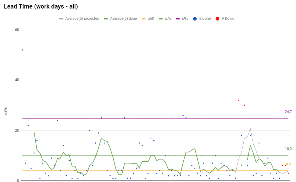
Looking at the chart, we can state that
- P95 (percentile 95%) is 24,7 days
- P75 (percentile 75%) is 10 days
- P50 (percentile 50%) is 4 days
It means that the team delivered 95% of the work items in up to 24,7 days, 75% of the work items up to 10 days, and 50% of the work items in up to 4 days. That’s what to be said. The rest is speculation.
A wrong approach to analyze the chart would be looking for the peaks (the dots above the purple line, the P95 line), then ask the team to break those user stories into smaller work items. Or scold team members because they didn’t focus on the two stories represented by the red dots above the purple line (which are both WIPs).
The point of measuring your system is not only taking action on outliers. Metrics are great to understand what happened to the team over time, and how it reflects in the numbers. The numbers are indicators to elucidate which part of your process needs improvements.
A real case
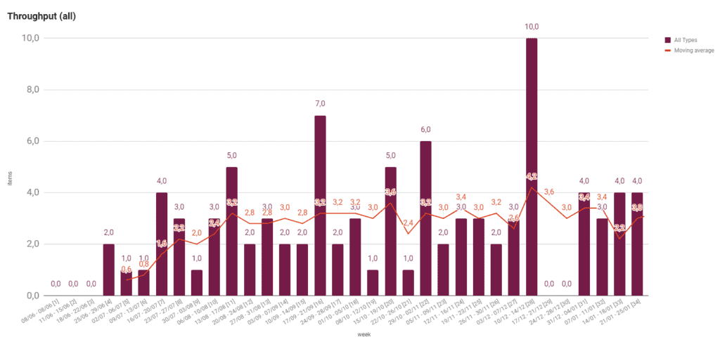
The chart displays the number of delivered work items (Throughput) by week. There is a gap of 2 weeks, where performance is zero. It happened due to a company’s policy that doesn’t allow deploys near Christmas. It’s a practice intending to prevent deployment of bugs when there was a peak of sales.
However, what caught managers’ eyes was the high Throughput in the week before the “deploy freeze.” The number of deployed work items was higher than ever. So managers asked:
Why was our Throughput that high? What could we do to keep delivering that amount of work items?
Those are fascinating questions. Maybe, the team could find what made it possible and implement it in their workflow. It would benefit and improve productivity.
The problem, though, was the answer, that summarizes as:
Pressure, and working after hours or weekends
The team made an extra effort to deliver all those work items due to pressure. They accomplished the goal with a cost: it made all the team exhausted. And therefore, this practice can’t be part of the routine.
The team’s Throughput may be improved. I don’t doubt that. But not like that.
That’s why I don’t recommend asking whether the Throughput is high, but asking whether the Throughput is healthy.
This chart, with no context, shows a big delivery, which is excellent. Looking for the context, though, we see that it was a terrible time for the team and an alert for the managers about the team’s health.
In short, metrics reflect the context and not the other way round. Always know the context before analyzing any chart, and only then think about what to do to improve the team’s productivity.
How do you and your team analyze your metrics?
Co-founder and CEO of SourceLevel. Previously co-founder of Plataformatec.
Loves to talk about software engineering, Elixir, coffee, mechanical keyboards, multitools and his 3 big dogs.